Design System
Objective
Speed up both design and development processes in order to rapidly transition Built In web products to new backend and frontend technologies.
Role
Design Lead, Design System Owner
Goals
Create accessible, reusable components to be used across several web products to speed up product development process
Work integrated with Engineering to establish components in code and ensure design and code are in sync
Document and communicate Design System components, status, and updates up to leadership stakeholders and down to other designers
―
In 2023, Built In needed to move faster. It was time to bite the bullet and finally tackle over 10 years of tech debt. In addition to improvements for existing products, there were big plans for new products as well.
As the manager of the previous Component Library, I was tasked to work tightly with the lead engineer to create base-level components that would form the foundation of Built In’s new Design System. We worked together daily to understand each others’ wishes and requirements in order to create what would become the foundation for all of Built In’s future web products.
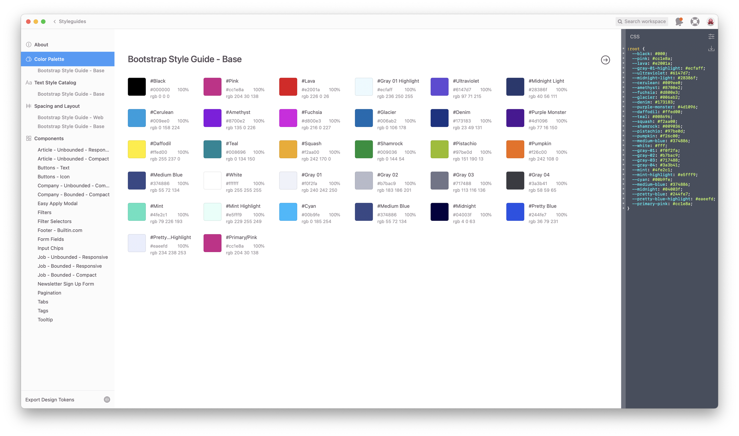
Base Components
The basis for our new design system lay in the grids, spacing, colors, typography, and iconography. Bootstrap was chosen to drive the frontend, so I worked with Engineering to understand how best to utilize Bootstrap classes and default components to make our system easy to use, yet flexible enough to allow for freedom in design where possible. Built In had a strong history of great design, so I wasn’t starting from scratch. However, our past designs sometimes caused issues with engineering and product timelines. It was a delicate balance to simplify our design values while still keeping enough flair to remain distinctly “Built In.”
Complex Components
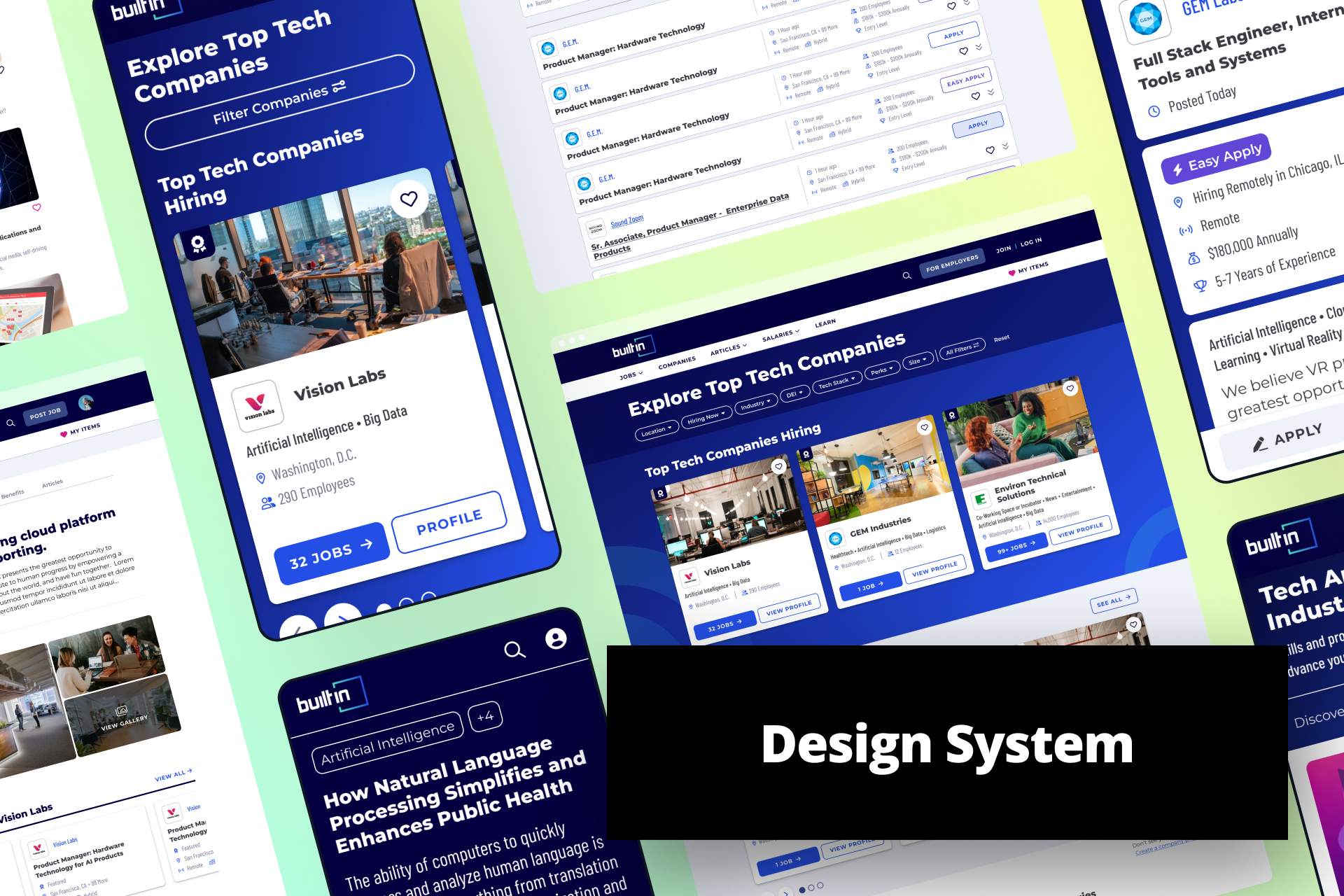
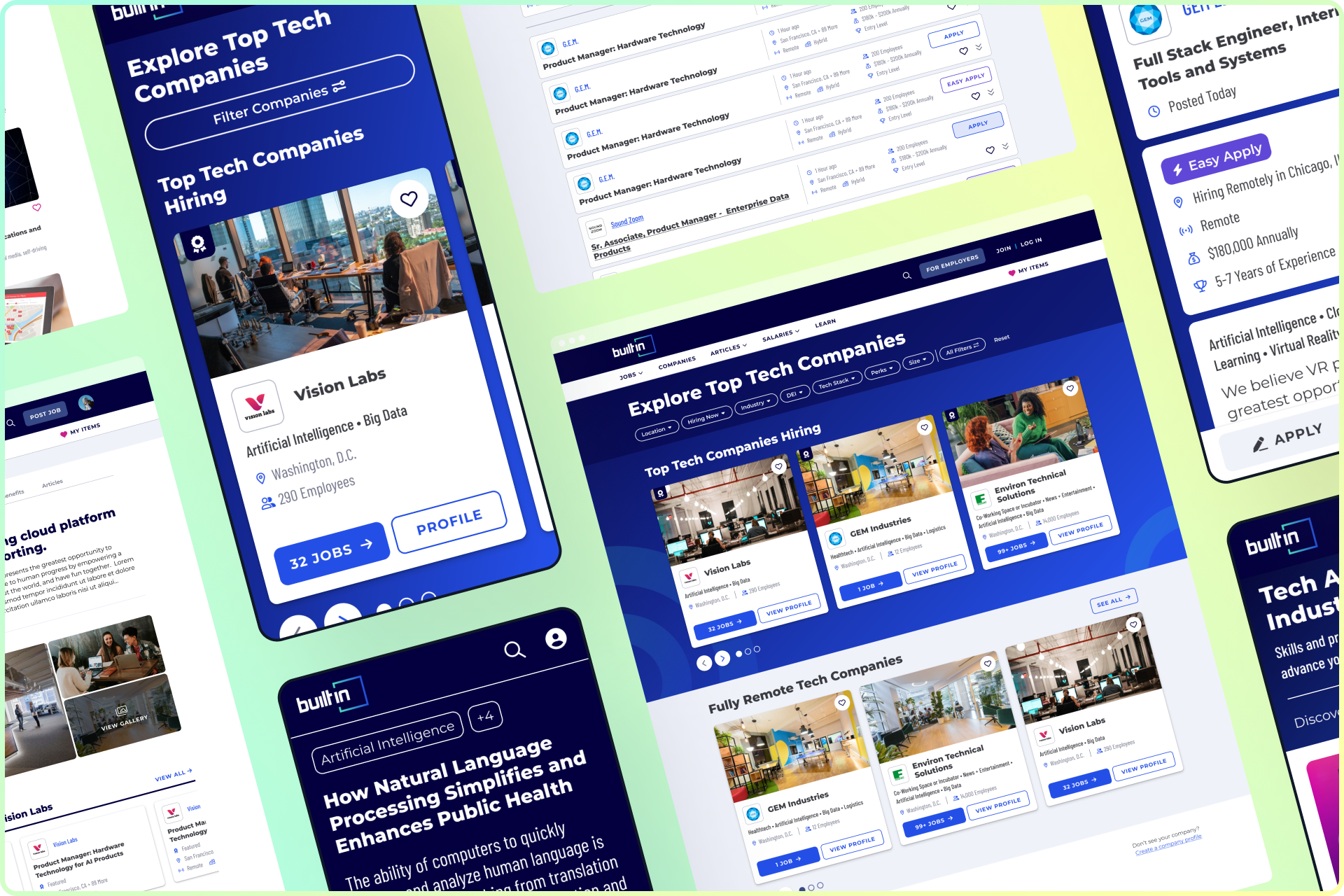
Much of what existed in the preceding Component Library was fairly basic — colors, fonts, buttons, form fields. Our aspirations were much larger for the Design System. As I began using the system to create screens for products, basic components came together to create much more complex components that could be re-used everywhere. Utilizing Figma’s auto layout, component properties, component variants, and other advanced tools, I created numerous responsive components for designers to use in nearly any situation. When components were ready, I worked with Engineering to ensure ease-of-use and correct responsiveness was captured. These components are now the starting point for designers when creating new screens.
Documentation
Creating the styles and components in Figma was only the beginning. Working side-by-side with engineering, we established naming conventions, limitations, and an organizational structure that worked for both Design and Engineering. We had been using Zeplin as our “source of truth” for some time, but never used the Style Guide feature. I worked to add all of our components to Zeplin, giving our Design System an external audience for the first time. And since this was new for everyone at Built In, I hosted a training session to educate Engineers on what to look for and how to utilize the new abilities we now had.


Designs + Impact
The Design System will have a long-lasting effect for product development at Built In. In less than a year, 14 products have been converted or created from scratch using the Design System. Since accessibility and responsiveness baked in, the designer-developer handoff process is significantly streamlined. Where designers used to hand off 4 breakpoints, the Design System allows the designer to now hand off just 2. And with consistent naming between Figma, Zeplin, and the code, developers know exactly what the designer envisions for implementation.
14
Web products created with this Design System in the first 10 months
450+
Responsive component iterations
¯\_(ツ)_/¯
Hours saved in design and development
Collaborators
Engineering: Raymond Van Hoecke
Design: Aimee Houck